You’ve probably had this happen. You get an idea but you ignore it because it’s a pain. The idea leaves you alone but it never really goes away. After awhile, you try it just to see how it would turn out.
For months, a voice has been telling me to redesign the covers for The Sciell and Chains of the Sciell. The voice was strong when I was working on the cover for Book 3, The Lost Sciell. I ignored it because I didn’t want to do all that work.
But we gotta do what’s best for the book.

Why the redesign? The covers aren’t terrible. They get attention at conferences.
- They don’t give any kind of hint to what readers should expect they when check them out. The title is ambiguous so I need a good cover image to tell the story.
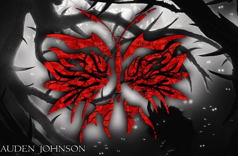
- I really like the cover for Book 3 but, as I thought more about it, I realized it doesn’t match these two.
- These books aren’t selling. I’ve changed the prices, keywords, descriptions and marketing plans. The only things I haven’t touched are the covers and the titles.
- The title font/design for Chains of the Sciell needs some work.

Then, I studied dark fantasy covers for inspiration.
Collect book covers and examine them to see if you notice any patterns. I have Pinterest boards for book covers by genre–focusing on fantasy, dark fantasy and horror. I noticed there aren’t any patterns when it comes to dark fantasy covers. I should’ve been prepared for that. That subgenre needs its own subgenres.

I did notice that dark fantasy artwork, not covers, tends to be black and green.
I have a color scheme.

I plan to keep this throughout the series.
You probably know this but when you’re creating covers for a series, there needs to be some similarities in the designs.
The Harry Potter books have different scenes on the cover but they’re all illustrated, feature Harry Potter and have the same font.
It doesn’t matter how you make the book covers match as long they look like they belong together.
I took the Harry Potter approach- same subject, font and style.
I had to work backward. The new covers need to match Book 3.

I needed an image to pair with butterfly symbol. That was the hardest part. Because I do cover design, I have a lot of stock photos on my computer. So, I searched through my collection and tried things out. It took awhile. I visited images I saved on Shutterstock for inspiration.
Here’s what I did for Book 1:

To ensure the font style is the same, I saved the file under a new name (Book 2) and changed the artwork. Here’s Book 2:

I let the designs sit for a day while I worked on something else. Every now and then, I came back to them to see if there was something I wanted to change. Then, I put the covers side-by-side to compare them. When I felt they were done, I sent them off to my publisher who liked them.
On to the next step.
The jacket was a pain to create. It took so long my hands started to hurt. And I made one major mistake with Book 2. Chains of the Sciell is a lot longer than The Sciell so the spine is wider. However, I designed Book 2’s cover on Book 1’s template. I ran out of steam so I haven’t fixed it yet.
Side note: If you’re working in Photoshop, make sure you change the color scheme from RGB to CMYK. RGB is for web while CMYK is for printing.


It’ll be awhile before the covers are changed online. I also took this opportunity to tweak the descriptions and keywords. Found out some places have old descriptions. I was too lazy to change them. I could’ve sworn I changed Chains of the Sciell’s description. This is a good opportunity to do some maintenance.
Keep an eye out for these new covers!


One thought on “Behind the Book Cover Redesign”
Wonderful article, Which you have shared here about the Book cover designing. Your article is very interesting and I liked your way to express your views in this post. Thank you for sharing this article here. Book covers for sale
Comments are closed.