Behind the Design: Creating a Dark Fantasy Book Cover
Writing and designing is work but it’s also relaxing. Often times, I’ll make a map or write a story purely for fun. Inspiration has been raining down. I have so many ideas. I have to figure out how or even if I put any effort behind them.
While listening to The Creative Penn podcast episode Author Email List and Newsletter Tips with Tammi Labrecque, I got an idea to revamp my newsletter freebie. Right now, you get The Unburned Island for free when you sign up for my newsletter. Labrecque said the freebie should be something that’s not also available for sale.
A couple of years ago, I wrote a side-story for my Merging Worlds series. I had that has my freebie but it didn’t work out so I change it. I’m revisiting it now, changing the cover and adding another story.
Here’s the old cover.

Not terrible. It’s a bit too much. At some point, there was also this cover:

But I don’t know if I did anything with it. That cover says nothing.
Since this is a Merging Worlds story, I needed to design the cover around the Sciell mark.

The Lost Sciell introduced a red one. So, I had a choice. Red or blue. I went with red because of one story in this book.

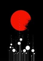
Photoshop is magic. Over the years, I added different brushes to it such as mountains, houses, smoke, trees. I use them mostly for mapmaking. In Photoshop, I can use these brushes as erasers, meaning I can put a house shaped hole in my artwork. For the Sciell mark, I used the smoke brush to create smoke shaped holes in the mark to create the burned effect.
The hardest part was designing something to go with this mark. It’s so…much that whatever it gets pairs with needs to be very simple or the cover would look crowded. I searched Shutterstock and iStock for background and border images. I tried them out before I bought anything.
Test drive your images before you buy them. It’ll save you a ton of money.
I tried a simple background and discovered something.

I lose that cool burn effect on the Sciell mark if the background isn’t white. So, I settled on finding an interesting border.

I loved this border but I let it sit for a few days just to be sure. There was something about it that bothered me. So I tried another one:

I loved this one but I ran into a couple of problems. It was difficult making the font stand out against the background and keep to the color scheme- more about the color scheme later. Although this is nice, the whole broken glass background isn’t exactly original. I might use this as a promo though. It’s nice.
I found these on Shutterstock:


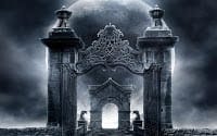
I like the border of the first one because it looks kind of like darkness. I loved the second border too because of those cracks. But one problem. The first image has a black background. Fortunately, Photoshop has an invert function.

Much better. Looks more like Darkness. I combined this with the cracked border.

Yes! This made me excited. This was speaking to me. Now, I needed to work with the color scheme. I didn’t want anything to take away from the red so the border was staying black. I thought to make the title font black but red and black are horror cover colors. This book is dark but it’s not horror.
Once I decided the Sciell mark would be red, I went to Adobe CC to find colors that could go with it.

Bright yellow was a definite no. Another color scheme suggested bright green. Another no. I’ve haven’t used those colors in any of the other Merging Worlds series covers. Fortunately, they suggested blue which is a dark fantasy color and it’s a color I’ve used often for this series.
So I had my colors. As I mentioned before, the border was staying black because I didn’t want it to take away from the red Sciell mark. So the blue would go in the title.
At first, this book was called The Awakening then The Sciell’s Dark Twist Fate then just Dark Fate. None of them were particularly interesting or unique. I used a random book title generator but that didn’t help. I wanted something with Darkness in it, something that hinted that the characters pulled energy from Darkness. Then I came up with Eaters of Darkness, which is perfect for the first side-story in this book.

I will admit, throughout this process, I was being more than a little indecisive. Some of my draft covers weren’t terrible. At one point, I had to tell myself to stop searching and make a decision.
Eaters of Darkness will be free for anyone who signs up to my newsletter. It’s not finished yet. I’ll keep you posted.
Update: Eaters of Darkness is now called Creators of Darkness and it available here.


I do like that last version.