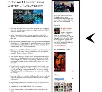
You want people to enjoy your website. You want them to share it. As authors, it’s often up to us to design our sites. We don’t always have the funds or the connections to have someone else do it. Fortunately, sites like GoDaddy, WordPress and Squarespace do most of the work for you. But, authors are serial offenders when it comes to poor web design. Here are a few design tips to get readers to stick around and tell their friends about your site.
Avoid light text on dark background
This seems to be the number one design choice for authors of dark fiction. I fell into this trap too. When I first started blogging, I figure I’d attract more readers if my site looked all horror-y, meaning have a black background with white or bright blue text.
When I started studying other site designs, I noticed most had a white or light background with black/dark text. I didn’t know the reason at the time but I wanted my blog to look professional so I dumped the black background and instead used images and font to convey “dark.”
Readers’ eyes get tired faster if they’re looking at a page with light text on a dark background.
You know when you’ve been inside all day, you walk outside and you’re blinded by the bright sun? That’s what reading on a dark background feels like.
If you want to have a dark background on your site:
White Space
Negative space is your friend. It gives your site a cleaner, more professional feel. Don’t try to put everything on one page. I far too often come across author websites where their home page is just cluttered. You don’t want people to get overwhelmed. You want them to have a relaxing time while they explore your site. When a page is too cluttered, important things get buried.
Use fancy fonts sparingly
I used to come across this more often. Not so much anymore. You can give your page headers interesting font but please keep your body text at a nice safe font like Times New Roman or Georgia. Don’t go happy with the italics.
Make social media follow links easy to find
When I share a posts on Twitter, I like mentioning the person/site I got the post from. There have been a few times where I couldn’t find the site’s social media links. Usually, I give up and don’t mention the person.
You might be thinking the site’s not on social media.
There are certain times where the author intrigues me enough that I want to find them on Twitter or Facebook. I do a search on those social networks. Guess what? I find the brand. Most of the time, the person is on social media but it’s difficult to find their follow button/link/widget on their site.
Please have your follow buttons some place people can easily find them.
They’re usually at the top of the page or in the sidebar. My blog has a floating social follow bar. It follows you as you scroll down the page.
Sidebars aren’t always mobile friendly
If you’ve spent some time online, which you’ve probably have, you might’ve noticed many websites don’t have sidebars. That’s because sidebars aren’t mobile friendly. In some cases, like with blogger, you can’t help but have a one.
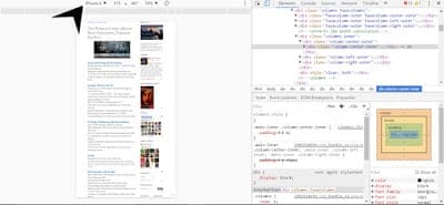
Try opening this blog on your phone.
No sidebar.
If you open this blog on a tablet or smartphone with a large screen, you may see the sidebar but the text will be too small.
This is something to keep in mind. Don’t put too much stock into your sidebar content. There’s a chance many of your readers won’t see it. If it’s important, put it on another page.
Blogger has actually up’ed their game when it comes to website templates. I haven’t changed my site design because I like having that big header. Many of the templates I like don’t have a large header space.
If you want to see how your site looks on different devices:
In Chrome:
Right click your webpage
Select Inspect
On this page, you can select different devices and Chrome will show you how your site looks on those devices.
Optimize images for slow internet speeds
Yes, we live in the age of high speed internet but there are still some people, me, who can’t afford fast internet. Generally, internet speeds in places like trains and parks are slow because some many people are logged on. It’s best to make sure your site loads fast for everyone so readers won’t give up and leave.
Reduce the size of your images.
As a blog tour host, I get book cover images usually at 1000px in width. That file is way too big to put online. It would slow the site’s load time. I shrink the image to around 800px in width. This size gets that nice big preview image when you share it on Facebook.
Most website hosts let you edit your image, including reducing the size.
Don’t be color happy
You many have three favorite colors. Doesn’t mean those three colors work together. Website templates come with themes. Most of the time there’s no need to change the colors. If you have to change them, find some that work well together. I’ve been using Adobe’s Color Wheel to find complementary colors.
We open a vein and pour our blood into our stories. Not something we can help. If we don’t put everything in it, the story won’t possess readers. This is all, slightly, romantic and all, but there’s a down-side. We can become defensive to criticism. My book has gone through beta readers, my publisher, an…
It’s always refreshing when you finish a project. I’ve been meaning to design more premade book covers but never had the time. I finally finished them. Here’s a look behind the scenes. I designed this image for my newsletter subscribers. Since I’m turning it into a book cover, I didn’t want to use it as…
Book’s don’t sell themselves. A nice cover isn’t enough. The description needs to be on point. Please never, ever say, “This story is about.” Do not go on any social media and say, “I wrote a book and it’s about…” That’s boring. It screams amateur. Some people can get away with it. My advice is…
Why do you need a marketing plan? Because you want people to read your book. You need a clear idea of what you want for your book and how you’re going to achieve it. I’ve tried winging it for the past..several years. I’m not seeing any results from it. Since I want my books to…
My beta readers gave me some great comments. Since I have a better understanding of where my series is going, I’m editing my first novel differently this time around. If I come across a pivotal scene, I make a note of it as reference for the series. This book brought up a lot of questions. I’m writing them down…
At the end of this week, I’ll be going to a job fair. Next week, I’ll be exhibiting at the Harlem Book Fair…Yay? Don’t get me wrong, I’m happy for the opportunity but the idea of talking to people, selling my brand face-to-face, is like walking through a haunted cemetery at night. This is why…


