Behind the Book Cover Part 2: Cover Reveal
It’s done. I’ve never been so happy to finish a design. In Part 1, I talked about how I began designing the cover for The Unburned Island. Now, you’ll see the results.
This was my first idea.

Then I stumbled across my favorite.

Looks haunted. Nice dark fantasy creature there. The image is illustrated to match other dark fantasy and paranormal covers. Simple enough that it can be paired with some dramatic fonts. One of my sketches in Part 1 had a forest as a background or branches merged with some font. It’s perfect.
Next, I needed a color scheme. To Adobe Color CC. I searched for fantasy and dark fantasy colors and came across these:

During this design process, I played around with all these schemes. It also confirmed my research findings that blue, black, white and purple were common dark/paranormal fantasy colors.
The came the hard part. I wanted this cover to focus on typography. I needed to find the right fonts. In Part 1, I mentioned:
Font Squirrel
1001 Fonts
Adobe Typekit

Didn’t like any of these. They’re all too hard to see. The combinations don’t complement each other.
Eventually, I found fonts, colors and arrangments that I liked:

Then I showed it to my publisher. She wanted to see the cover without the color. I took away the purple.

At that point, I’d been working on the cover so long I couldn’t tell if I liked this version or not. I needed more opinions. I’m a part of several Facebook Groups, one of them being Colors in Darkness. I asked group members which cover they preferred. Overwhelming, they liked the black and white one. They also said I should do something with the font so I won’t get lost.
Here came the next challenge. Finding a font color. This took forever. I tried different blues, purples, greens and reds, a green/blue/yellow gradient and an orange and yellow gradient. I never really appreciated just how many shades a color can have.

I didn’t like any of them. I took a break. I was getting frustrated and couldn’t think clearly. Days later, I was working on something else when it occurred to me that I could use a pattern instead of a solid color. I can create patterns from images. I tried different images.
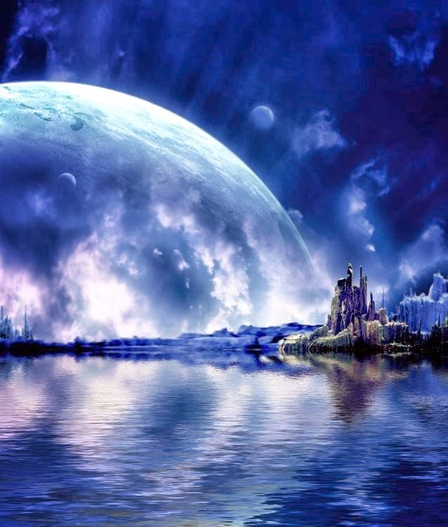
This one looks magical and matches my color scheme.

Since the story’s called The Unburned Island, I figured this would give the font a nice flaming look.

In the end, I went with this one because I like the clouds when paired with the font. It has a magical and dark feel.

I played with the colors a little more and here’s the final cover! It came out looking more like an ocean than clouds. I like it. So does my publisher.

Summary:
The entire island was on fire yet only one building was destroyed. Everyone disappeared. The schoolhouse remained unscathed. People believe it’s now haunted. The school and the island remained abandoned for years.
One day, Kiran, En and a team of magical investigators travel to the island to banish whatever haunts the schoolhouse. It takes them no time to realize the building isn’t the problem. The island is.


