It takes a lot of work to be an author. Being an indie author is even tougher because you have to do everything or hire someone who can. You are the CEO of your own business.
Indie fantasy and paranormal books are beautifully diverse. More so than traditionally published books. They are the kind of diverse I’d like to see more in mainstream media. I love indie authors.
It breaks my heart when I see indie books with bad covers or promo images. Most authors aren’t designers. But most of us aren’t in a position financially where we can hire someone to take care of all our design needs. If you run a blog, it could get expensive to hire a designer every time you want to write a post.
I’ve released 13 books and I’ve never had the funds to hire a designer. There was nothing left after editing. Even now, I barely have money to cover food and bills let alone hire freelancers. What am I going to do, not create a promo post? You need to make the most of what you have.

When I was first starting out and even just a couple of months ago, I produced some not great designs. Right now, I’m going through my blog posts and changing the main images since I get a lot of traffic from Pinterest.
This:
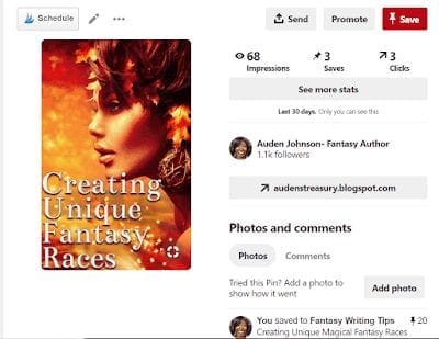
became this:
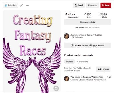
As you can see, ever since I changed the image, engagement and traffic from Pinterest shot up. The first image isn’t bad but it wasn’t working on social media. There’s something wrong with it. I think there’s too much going on.
That’s one of the biggest issues I see with designs from indie authors. There’s too much going on.
Stop trying to put every major theme on your book cover or promo image. Don’t go font crazy either. As I learned more about design, I ended up redoing most of my covers.


I need to fix a couple of other covers.
How can you be good designers when that probably isn’t your background?
Study Other Designs
I often look at author images and think, did this person even look at, really look at, a fantasy book cover. Go on Google or Pinterest and examine other book covers or other ads. It doesn’t need to be book related. I got a poster idea from an ice cream ad.
Do the same thing for websites. When I first started out, this blog had a dark background. I wrote dark stories and thought that would be cool. Then, I looked at other websites and realized they all had white or light backgrounds. So, I changed my blog design. Didn’t realize until later that reading light text on a dark background makes people’s eyes tired.
I also noticed that on Instagram, these:
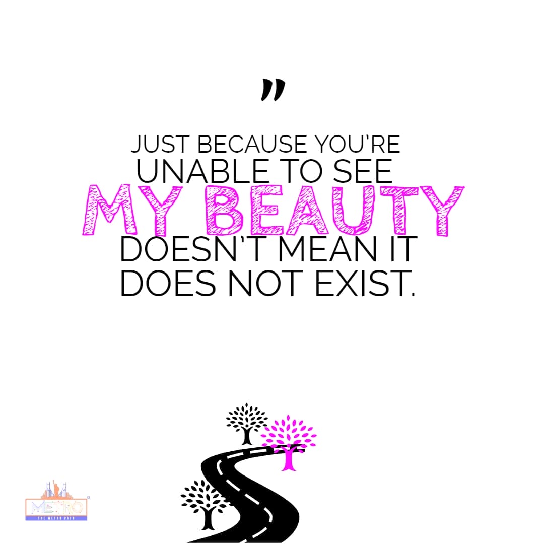
do better than these:
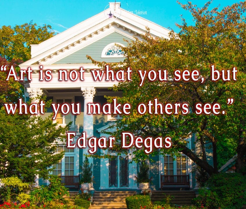
The above image is bad design on my part. Again, there’s too much going on. This may have worked if the quote was shorter. Or if I post the image by itself and caption it with the quote.
Take a Class
If you can, I highly recommend taking any kind of design classes. If you have the funds, check out Skillshare. I use Lynda.com because I can access it anywhere for free first through NYU and now the New York Public Library. It’s pretty expensive so I don’t recommend buying it.
I was fortunate enough to be able to get a Masters in Publishing from NYU. My focus was on digital publishing. Social media marketing (images are key) and UX (user experience design) are very important. I did a lot of designing in those 3 years.
Subscribe to YouTube Design Channels
If you can’t take a class, go on YouTube. I’ve learned a lot from watching time-lapse videos of people designing things.
Read Trend Reports
Because I sell photos on sites Shutterstock and iStock, either at the beginning or end of the year, I get design (visual) trend reports emailed to me. They’re available to the public.
2021 Creative Trends by Shutterstock
Read/Watch Design Critiques
I don’t come across these as much as I’d like but I enjoyed reading posts where people present covers and talk about what they like or don’t like about them.
Book Cover Critique with Designer Patrick Knowles
Use Templates
Most people use Canvas. I use Adobe Spark because it comes with Creative Suite. It’s great for making fast promo posts. I could design the images in Photoshop but it’s so much faster to use a Spark template. And, Spark connects you to free royalty-free images right in the design tool. I could create a quick Instagram Story.

Consider Investing in Adobe Creative Suite
At close to $60 a month, it can be pretty pricey but you get a lot for it. I discovered Create Suite also gives me 100 GB of cloud storage space. With Adobe products, you can do a lot with very little. I made this:
using free royalty-free video and music, content I already owned and animation that comes with After Effects. I didn’t spend anything extra to make it. With Photoshop filters, this photo:

Can become this:

But Adobe products are not easy to use. I’m pretty good with technology. Most times, I jump into a program and figure things out. I tried that with Photoshop and I could not figure out how to even begin.
…
It’s a lot, I know. And you need to keep up with design trends. A lot of the 90s cover art design won’t work today. You need to pay attention to color too. Pastels and multi-colored images are great for Instagram. They also can be good for conferences. The blue in my Sciell cover draws people to my booth, especially when that booth is outside with the sun hitting my cover.
I know a lot of people say to hire a designer for your cover. In most cases, I agree. The bad covers out there prove authors aren’t the best cover designers. But what do you do when you feel driven to publish a book but can’t afford a designer? Do you wait until you’re in a better position financially? I finished grad school in 2016 and have been having money troubles since with no end in sight.
Read advice but follow your gut. If you think it’s better to wait to publish your book, then wait. When I first started out, I got Photoshop and gave myself 5 months to design something or I’d find an alternative. I made the Sciell mark:

You never know what you can and can’t do unless you try. Be observant. Study designs the way you study other books. Ask for advice. I never release a cover without asking people what they think of it.


One thought on “How Authors Can Learn to Design Eye-Catching Images”
Comments are closed.