I have a love/hate relationship with book formatting. I like that, with InDesign, I can get creative with the book’s layout. But, I’ve published 15 books and still haven’t streamlined the process. I mention in 9 Things I’ve Learned About Print Book Cover Design that I’m creating a hardback version of The Sciell. After formatting 15 books, I still run into issues.
I’ll upload the file into KDP or IngramSpark, preview it and find something wrong. I’ll fix it again, upload the new file, preview it again and find something else wrong. This repeats over and over until I’m no sick of looking at the book. I get tempted to let certain things slide because I don’t feel like fixing yet another thing.
Back when I published my first book in 2014, I believe Word and InDesign were the biggest book formatting software. Now, authors can choose from a number of apps. InDesign is probably the hardest to use but I stick with it because Adobe apps give me a bit more creative freedom.
Here are a few things to keep in mind as you format your book.
Format your book with facing pages
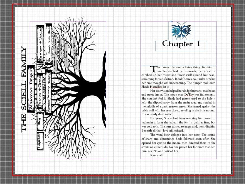
Most authors format their books in Word or a specialized app. I use InDesign. If you can, format your book with your pages facing each other, like this:
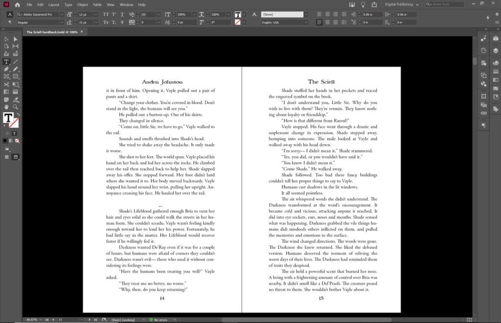
You’ll get a better idea of how your book will look in print and you can pick up certain issues like uneven pages.
What are Bleeds?
I didn’t start dealing with page bleeds until I wanted my maps to fill the entire page.

Adding a bleed is kind of like making your book slightly larger to avoid having any white space around certain images. It took me a long time to get this right.
This red line in the image below is the bleed area. I made it brighter so you could see it. The line isn’t usually this wide.

If I want an image to cover the entire page, it needs to touch those lines. Publishers like Amazon and InstgramSpark have guides on the measurement for your bleed. InDesign has a specific place where you add bleed to your file.
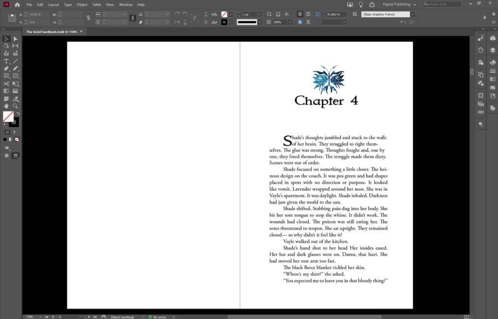
Chapters always begin on the right side
If you look at other print books, you’ll notice all chapters begin on the right side. If the previous chapter ends on the right, you add a black page after it and keep going.
Don’t Use Tab
Both Word and InDesign have a way you can set paragraph indents. Use that instead of the Tab button. When uploading your book, most publishing tools ignore Tabs. If you don’t set indent using Paragraph Styles, your book could come out looking like a long 300+ page paragraph.
Watch out for Word Spacing
This is a constant problem for me. I never touch the spacing between words. It’s supposed to be the same throughout the book yet something like this happens.

I didn’t add those space. I still don’t know how to prevent this from happening. Be on the lookout for stuff like this when you’re previewing your book.
Beware of Orphans and Widows
When book formatting, you’ll sometimes end up with a lonely word or phrase at the top or bottom of your page. Like this:
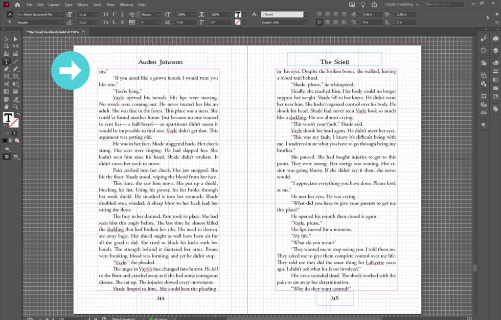
Stuff like this makes the book visually unappealing. You want to avoid this. Formatting The Sciell to remove these stray words was something special.
I read it was all right to let a few stay but you should remove as many as you can.
Images Need to be Anchored
I’ve only ever used InDesign to format books so I don’t know how other apps handled images that don’t cover the entire page. But, for InDesign, images like the below chapter header need to be centered and anchored. If not, it may be in a different position when I upload the file.

You want your book to look as polished as possible. Most people, like me, can’t afford to hire a designer. Adobe apps are expensive as difficult to learn but I’ve found that they’re useful when you want to create something but you can’t spend hundreds even thousands of dollars doing it.
Got any questions about book formatting. Comment below.

