Like a story, everything on the book cover needs to be there for a reason. Covers for self-published books have gotten a lot better. However, I still come across some cringe-worthy designs. Even if you’re hiring a designer, you should know the elements of a good cover so you can better judge the finished product. This post will also help you when you’re creating teasers.
Simple
Often, I see book covers with too much on it– as if the author wanted all the themes displayed. Don’t do that. The cover will come off as cluttered. Readers won’t know where to look. If you’ve noticed, book covers tend to have only one main subject. Romance books are the exception. They generally have two people on the cover.

This cover is on the edge of being too cluttered. There isn’t a lot of negative space. I might have to take off the framing element and simplify the title’s font. Although the cover has a lot of parts, the main focus is the house with the winged female being secondary. If the female and the house were the same size, the cover would be too busy.
Symbolic
You have this awesome scene in your story and you totally think it would look great on the cover. It won’t. This tip goes along with having a simple design but it needs to be separate. My book, Chains of the Sciell, is about powerful characters with connections who are trapped in a house that’s alive. Instead of trying to put all that on the cover, I just did this:

Then there’s this cover. I saw it in the bookstore. It got me to pick up the book and check out the description.

Totally symbolic.
Don’t be too literal with your covers.
Balance
Don’t put every design element on your cover. If you want a bold font, it might be best to go with a simple background and vice versa. The below image is so dynamic that putting too much on it would make the cover scream and not in a good way.

The image is loud but the typography is simple. I’ll need to change the title design because the word isn’t as clear as I like it to be.
The placement of different elements can also help or hurt the balance. In the above cover, there’s an invisible line down the middle and everything sits on that line. If the title or author name was too far to the left or right, the balance would be thrown off. As it happens, the author’s name might be a bit too far to the right.
Typography
I love, love fonts. I love playing with them. I have to hold myself back. I’d put four or five different fonts in my designs. Don’t do that, unless the text is the cover design. Depending on the image, I usually pick two fonts, one bold and one quiet.
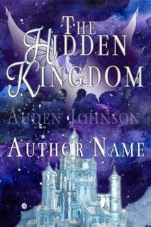
The font depends on the image and genre. The above combination wouldn’t work with this cover.

Color
I’m still learning about this. Colors have emotions and weight. Certain genres have color schemes. I’ve noticed, for instance, that paranormal fantasy covers tend to be black and blue. The right colors can get people to take action. The right combinations can enhance a design. If I have an image, I’ll sample the dominating color and plug it into Adobe Color CC, which is free, to find the right scheme.

Check out Psychology Of Color (Infographics)
Seamless
This might be the designer in me but there are certain covers I look at and can tell which elements were added. The cover doesn’t look like one image, it looks likes a collage. The author/designer didn’t blend the images well.
For the below image, I liked the basic design but wanted a different face. I add a new one to the design. Hopefully, you can’t tell. Your book cover should look like one image. I spent a lot of time playing with the blending options in Photoshop.
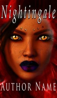
Blending the female’s nose nearly drove me insane.

Design for small screens
I come across this problem on Instagram often. An author will post a teaser or an image quote. The background is nice but the text is too small to read on my phone. Or, they’ll put too much text on the image. Be simple also means be moderate with the amount of text you add. Sometimes, you can’t help it. Books with subtitles often have this problem.
I’m not sure about this image. The different font colors and sizes might make it easier to see on a small screen. I think it’s too much.


More Resources:
Designing Book Covers that sell – the 7 Must-Haves: Derek Murphy (Video)



2 thoughts on “What Makes a Good Book Cover”
Wonderful article, Which you have shared about the Book Cover. Your article is very important and I really enjoyed reading it. If anyone looking to buy Custom book covers at online, then visit at Premade book covers
The book cover is the only place of a book that attracts more eyeballs. It is an ad in itself and most people look inside if they get attracted to the book cover. To make an extraordinary book cover design, one has to use compelling words and engaging design. It takes time to make a unique book cover. There is no shortcut for this.
Comments are closed.