Have you ever seen a beautiful infographic and wonder how it was made? Here is your guide. Anyone could get some benefit to creating infographics, especially authors.
Book Promotions
It would be nice if I could hire a designer to create character and land artwork. But, I can’t. I don’t have the funds for it. The next best thing would be an infographic. I created this to introduce some of my characters.

I was actually surprised how popular this was. You could use infographics to describe characters, interesting facts about your world, some history…any information you think readers would want to know.
Repurpose Content
Naming Your Fantasy World is still one of my most popular posts. So, I took that information and turned it into an infographic.
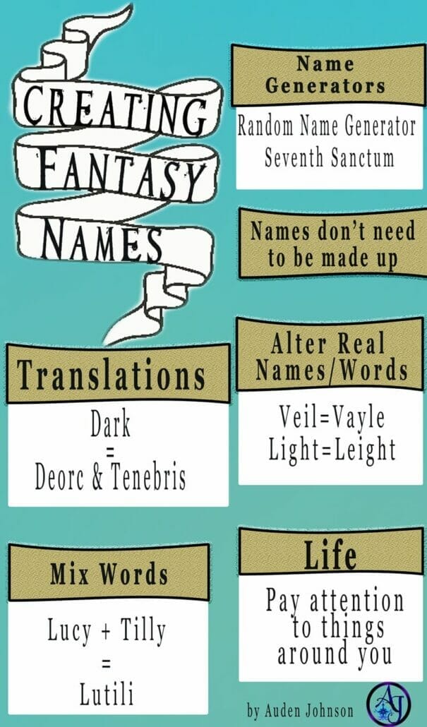
I was surprised by how popular my Writing Haunted House Story post became. So, I turned that into an infographic.
Quotes
You know how much people love quotes. I, more often, see infographics of inspiriting author quotes. I didn’t create this one but the Superhero quote one was a brilliant idea!
Research Findings
People like to get behind the scene info about books. Did you find some interesting info during your research? Turn it into an infographic and share it on social media. Readers and other writers will enjoy it.
Bookish Facts
There are actually a lot of cool book and movie related infographics out there. And, as writers are heavy readers, this is right up our alley. Talk about genre tropes. If there’s a series you love, make an infographic about the characters or the timeline. List your favorite characters from your genre.
How do you start creating infographics?
Brainstorm
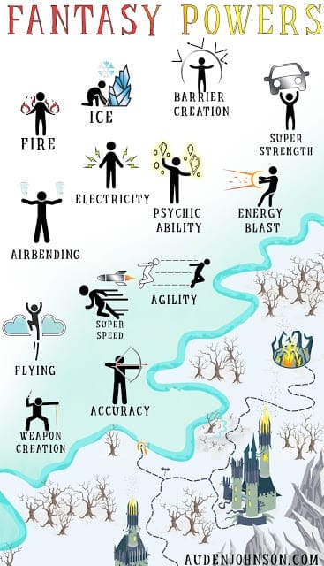
Before you start designing, think about the topic you want to cover and write down your bullet points. Just for fun, I’ll be creating an infographic on fantasy powers. It’s a wide topic and I don’t plan on listing every ability. I’m including some of my favorites. Here are my bullet points:
- Fire
- Water
- Electricity
- Ice
- Super strength
- Psychic abilities
- Flying
- Speed
- Barrier creation
- Accuracy
- Energy attacks
- Agility
- Airbending
- Weapon Creation
This came out longer than I expected. Yours doesn’t have to be this long.
Research
Before you start designing, search Google and/or Pinterest for infographic examples. They don’t have to be related to your topic, just find designs you like and collect them in one area. I usually add them to a Pinterest board.
Examine the designs to find out what they have in common and what you like about them.
Find The Right Color
Infographics are generally all about color, usually pastels. Most don’t use a lot of darker shades. Before I design anything, I search Adobe Color CC for color palettes. I select Explore then search for themes. Last time was horror, this time is fantasy.
Here’s my palette:
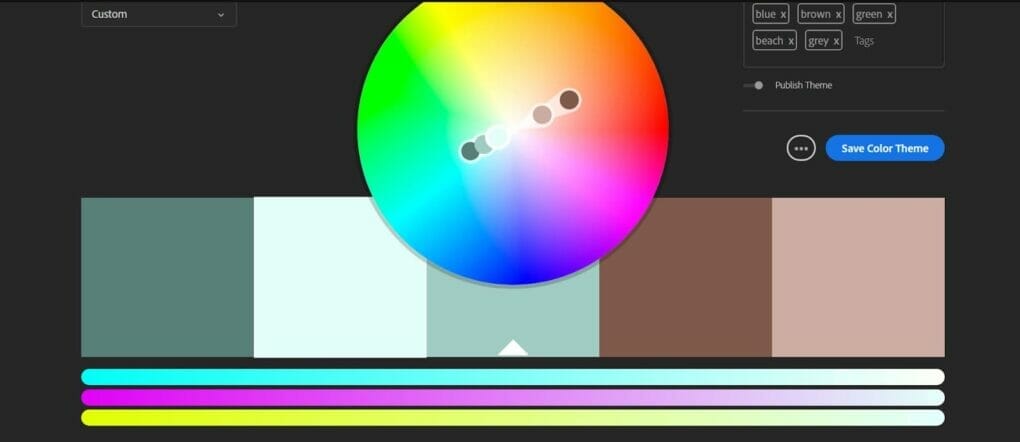
Authors, authors, authors, please be careful with colors. I’ve noticed authors like to put all the colors in their design or they pair two or three that shouldn’t be together. Check out Adobe Color CC or simply Google/Search Pinterest for “(theme) color palettes”.
Whenever you open a color picker, you’ve probably noticed, in the box, a series of numbers starting with #.
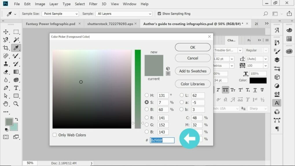
Those are hex codes. When you search for color pallets, most sites will give you the hex code. Copy that number and paste it into your color picker. When you find a palette you like, stick with it.
Size
This depends on where you’re sharing it. If you’re putting it on your website or on Pinterest, then 736 x 1128 px would be good.
If you’re sharing it on Facebook on Twitter then 3300 x 2550 px would be better.
With Photoshop, you can expand or cut it down as much as you need using the Crop tool. I know, ironic. Crop usually means cut. But, in Photoshop, Crop could mean adding more space to your image.
The Pinterest size for my haunted location infographic turned out to be a little too small. Changing the dimensions would also stretch all the images and text, which would be a pain to fix. I used the crop tool to make the background image wider and longer.
Find Images
Those images in infographics are called vector graphics or illustrations. You do not use photos for infographics. Actually, for quotes, people will often add photos of the authors but more often, they use illustrations.
When I’m strapped for cash, I use Pixabay. They have a great collection of vector graphics and illustrations. It’s free to use but it is limited. You’d have to get creative. I have a subscription to Shutterstock. I get only 10 downloads a month but it helps. If you have the money, search a stock photo site for vector sheets. Something like this:
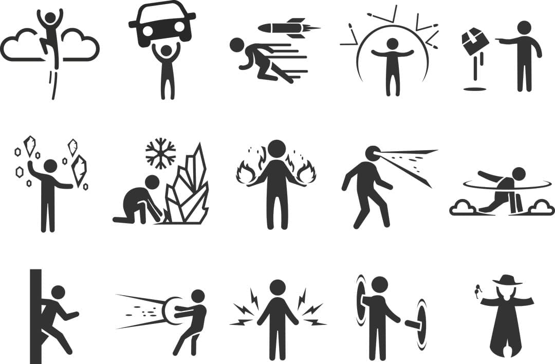
Infographics require a lot of images. Finding the ones you need in one image would make your life a lot easier. I went on Shutterstock and searched for fantasy powers. When I found the above vector sheet, I searched for similar images.
Side note: Vectors often come as a .esp file. You can scale it to any size and often, the background is transparent. I don’t know if something like Canva or Adobe Spark can open .esp files. I also don’t know if you could isolate one image on a Vector sheet and move it somewhere using those apps.
Shutterstock also has infographic templates but they often have writing on them. You’d need to know how to remove the text or properly cover it. That can usually be done in Photoshop using the Fill-Content Aware function.
Also, some of my infographics will have a frame or a banner. I’ve gotten them from Shutterstock.
Now It’s Time To Design
Some people will draw how they want to lay out their information. I don’t, probably should. Look at your collection of infographic examples. As I mentioned before, some sites may have templates you could use. I would suggest you go simple at first, at least until you get the hang of it.
This is an infographic.
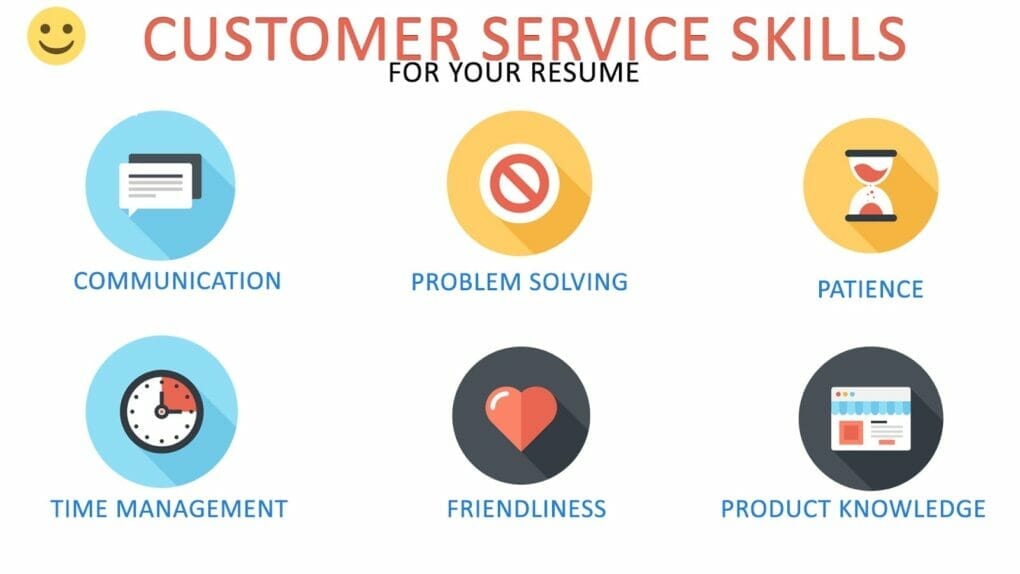
Not complicated. Simple to make. I didn’t design those colorful icons. I simply found a vector sheet that contained a ton of icons and then arranged them how I wanted.
Most infographics for authors are a list of words to avoid or synonyms. Often, they’re a lot of text and few images.
Something like this:
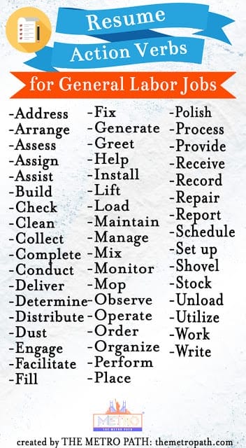
Here’s my finished infographic. It’s not simple mostly because I had fun with it. You don’t have to do all this.
If you have any questions, comment below!
I’m thinking one day, I’ll have to use Canva. Photoshop is complicated to learn. It’s easy to use once you know what you’re doing but it takes a while to get to that point. I created a guide for authors who want to learn Photoshop. How to Learn Photoshop as an Author
Most authors don’t want to go through the trouble. I would encourage you too though. I use Adobe Spark when I want to create something quick but I often get annoyed with its limitations.


