Working on a new design while your computer slowly dies is a special kind of…fun. I’d lose internet so often I’d give up on creating for a few hours. The computer moved sooo slow that the certain elements kept sticking and ending up in places I didn’t want them to be. But, a computer that can handle Adobe products costs about $1,000. If I have that much in my account, I haven’t paid rent yet.
Despite the annoying tech issues, I finished the cover for Book 2 in my paranormal investigator series….sort of finish. I showed the cover WIP to my publisher and they wanted to post it online. We may change it later. This series needs a title, at the very least.
Book 2: The Screaming Town would be just as type focused.
Because of The Lost Sciell’s cover, I wanted this one, The Screaming Town, to have some red as one of the dominant colors. At book conferences, people always went straight to The Lost Sciell because it’s the only one of The Merging World series with a bright red Sciell mark.
But, red is a horror color and The Screaming Town is not a straight horror book.
Actually, I have a bit of trouble figuring out the genre for this series. It’s about magical characters solving paranormal mysteries. It would be straight paranormal except the stories are set in a fictional world. I call this series dark fantasy or paranormal fantasy. Dark fantasy book covers are usually blue, black and white. Some have red but it’s rarely the dominant color. I search Shutterstock for paranormal and dark fantasy images that spoke to the story and added them to this
Collection.
I found this and fell in love.
In The Screaming Town, Kiran, En and co. are on vacation in a historic town with some impressive, ancient and malfunctioning magical wards.
But, that’s a dynamic image. What would I pair with this? I don’t want to use it by itself because some other author may end up with that same cover.
I figured I could use the image on its own but zoom in on a certain part.
Not bad but it doesn’t really match book 2. It needs something more.I also found this image on Shutterstock.
But, it’s blue. Too much like Book 1. If Book 2 is the same color as Book 1, then Book 3 and all the other books would need to be blue. I tried to blend the above image with the red one.
It didn’t work out. I couldn’t figure out how to blend them without it looking terrible, I was stuck. Then, I remembered I used this image for book 1.
Maybe I could use a similar image for all the books in the series and just zoom in on different parts. Shutterstock has another throne image that I already owned.
So, I zoomed in and played around with the placement until I found a part I liked.
Okay, we’re getting somewhere. Now, time to work on the type. I already had a lot of fonts installed on my computer but none of them were working out.”Screaming” was a bit too long of a word to property fit on the cover. I switched the titled to The Wailing Town and started searching for fonts on 1001 Fonts. I love this site for some nice free royalty-free decorative fonts. Found a couple I liked:
I’m leaning towards the last 2.Now, let revisit that red image.
I worked with it a bit more. And, here’s where I am right now.
I’m still playing with the font but I don’t think I’ll be changing it much unless my publisher says something.Just for fun, I found this on Shutterstock.
I added the font to the cover.
Here’s another version with the red more pronounced.
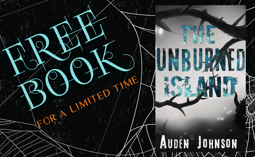
It’s still horror colors with its red and black but the magic circle and font give it a fantasy feel. The thorns provide a nice frame.


Very creative!