Behind the Design: Fantasy Map Making
Before the world ended, Cayden was the center of technological advancement. Now, it’s a paradise for only a select few. It’s a story parents tell their children to distract them from the living nightmares.
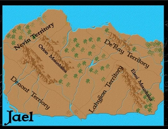
For my Merging Worlds series, Books 1-3 take place entirely on Jael. Characters mention other provinces but they don’t visit them in the story. But in Book 4, a few characters start in Jael, another group is in Annissa. Some will travel through Sorin. Then, Cayden has a special story in Book 4.
Since characters are traveling to different lands, I’ve started updating my maps, adding more textured and details. They’re all be added to Book 4: The Sciell’s Legacy.
Annissa started out like this:

Now it’s this:

It’s Cayden’s turn.
It started out like this:

Funny thing happened. Most of you know I got a new computer a couple of weeks ago. When I opened the map, I realized this computer didn’t have half the stuff I needed. No font, no images, no brushes. Before I started working, I had to redownload everything I needed.
I’m no longer a fan of that land texture in the original so, I search Shutterstock for better images. I found this:

For designs complicated like this, I use Photoshop. For simple text headers, I sometimes used Adobe Spark. Photoshop this function where you can turn images into patterns and texture to easily apply them to graphics or text. I defined the above image as a pattern, applied it to the map and lightened it a bi.

Much better!
But, the new land texture messed up my forest colors a bit so now it’s time to fix them.

Loving the green. Basically, I’m creating a new land area that only includes the part under the trees. Then I edit that layer to make it look like a forest.
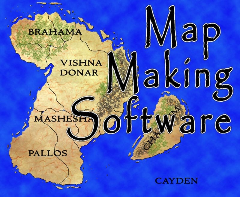
But, there’s a little problem with Challum. The mountain is entirely grassy. Don’t want that. But it’s an easy enough fix. Just change the texture under the mountain ranges the same way I changed the forest.

While searching for inspiration on Pinterest, I found a fantasy island map with a nice gradient around the edge to show shorelines.

For me, map making is knowing the basics of map design and Photoshop. Then, I examine other maps and figure out how I could use Photoshop to duplicate that effect.
By Book 4, all the lands in the world are surrounded by a barrier of darkness. People can go through the wall but most suffer serious and lasting mental problems if they do. So, most people don’t travel.
The barrier around Cayden is different. Only certain people are allowed through because Cayden is kind of a heaven for a chosen select few.
In Book 4, most of the world gets about 30 minutes of sunlight a day. When talking with a fantasy group on Facebook, I learned the no sunlight things can have some serious problems on the planet. So, I designated a part of the world where the sun rises and sets like normal.
Cayden is in that part. The Masters of Darkness created this place for people who are loyal to them These masters, in The Merging Worlds series, don’t get more powerful at night. The sun doesn’t affect them whatsoever. They’re hiding the sun from most people because that creates more negative emotions, which is their food source.
I’m still working on a way to show the barrier around landmasses. It’s this for now:


This is pretty cool! How long did it take you to make all of these maps?
Thanks! It took a couple of months, maybe 2 or 3, the first time. The updates took about 2 days.
That is cool!